
The Impact of Responsive Design on User Experience for Business Websites
Posted By Remote Techs On 10-January-2024
In today’s ever-evolving digital landscape, where businesses rely on their online presence for success, responsive design plays a pivotal role. As a leading tech solutions provider, Remote Techs understands the profound impact that responsive design can have on the user experience of business websites.
One key aspect that sets Remote Techs apart in the tech industry is our unwavering commitment to staying at the forefront of technological advancements. Responsive design is a cornerstone of our approach, and here, we delve into the tangible benefits it brings to the user experience of business websites.
1. Adapting to Diverse Devices
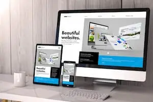
In the dynamic world of digital devices, users access websites from various screens, ranging from large desktop monitors to compact smartphones. Responsive design ensures a business website seamlessly adapts to these diverse devices, providing a consistent and optimal viewing experience. This adaptability caters to individual users’ preferences and reflects positively on the brand image of businesses.
2. Enhanced Accessibility
Accessibility is a fundamental aspect of user experience. Remote Techs recognizes that a website’s reach extends to users with varying abilities and disabilities. Responsive design goes beyond visual aesthetics; it ensures that all users can navigate and interact with a website effortlessly, regardless of their device or ability. By making our websites accessible to a broader audience, we contribute to an inclusive digital environment.
3. Improved Page Loading Speed
In the fast-paced digital era, users expect instant access to information. Slow-loading websites can drive potential customers away. Through its commitment to responsive design, Remote Techs optimizes websites for swift loading across devices. This enhances the user experience and positively impacts search engine rankings, a crucial factor in today’s competitive online landscape.
Contact Remote Techs For IT Support Los Angeles Today
We provide comprehensive, tailored solutions ensuring smooth and secure operations. Trust our expertise to empower your business for growth and resilience.
Contact Us4. Streamlined Maintenance
As a tech solutions provider, Remote Techs understands the importance of efficiency in website maintenance. Responsive design streamlines the process by eliminating the need for multiple website versions tailored to different devices. This saves time and resources and ensures that updates and modifications are consistently applied across all platforms, maintaining a cohesive online presence.
5. Google’s Mobile-First Indexing
In search engine optimization (SEO), Google’s mobile-first indexing has become a game-changer. Recognizing the prevalence of mobile users, Google prioritizes the mobile version of websites for indexing and ranking. Responsive design aligns seamlessly with this approach, enhancing a website’s visibility and search engine performance. At Remote Techs, we prioritize responsive design as a strategic element in our SEO endeavors, ensuring our clients’ websites rank high in search results.
6. Future-Proofing You’re Online Presence
The digital landscape is in a constant state of evolution. Technologies and user behaviors change, and businesses must adapt to stay relevant. Responsive design is not just a current trend but a future-proofing strategy. Remote Techs emphasizes the long-term benefits of this approach, ensuring that we design and develop websites equipped to evolve alongside technological advancements, keeping our clients ahead of the curve.
As we navigate the digital realm at Remote Techs, we understand that responsive design is not just a feature but a fundamental element that shapes the user experience of business websites. By embracing this approach, we ensure that our client’s online presence is visually appealing but also accessible, efficient, and future-proofed. As technology advances, Remote Techs remains at the forefront, delivering innovative solutions that elevate the user experience for businesses across the digital landscape.